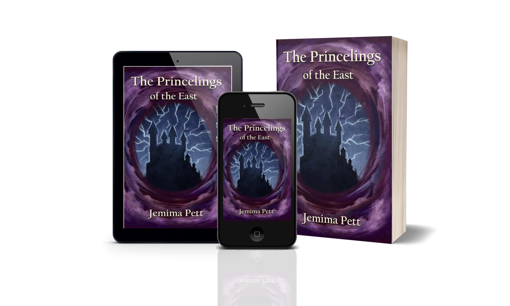
During my blog tour for the Princelings of the East a couple of weeks ago, I had some lovely reviews, interviews and comments. One very nice review commented it’s “an amazing book jam-packed with mystery and action.” However he also went on to say “Overall outwardly the book title and cover is very deceiving however the plot is absolutely brilliant.” As he is aged 13, he’s exactly the sort of reader I need this feedback from. Would other boys his age turn away from it because of the cover?
This is good feedback, since although I have had comments that say they like the covers, I’ve always wondered how good they are. Do they sell the books? Do they entice people to read them?
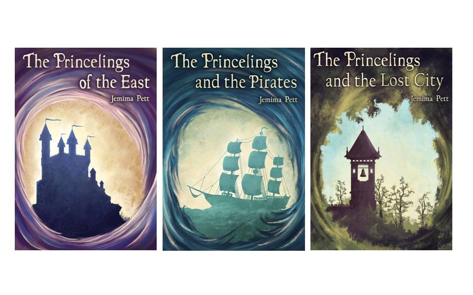
There’s definitely development in the book covers. As I start to think about the one for the latest book I find myself also wondering about the first. I wonder what we might come up with if we did the first book again. And should I change the title? At one point I called it “The Princelings and the Great Energy Drain” but I didn’t think that sounded enticing, either. “The Princelings and the Time Tunnel” rather gives the game away, I think, although you then know you’re in for a time travel adventure, and solves any problem of people reading book 4 first.
What do you think?
There’s a poll in the right hand margin to ask you which you think is the best cover – ‘best’ being what you want it to mean, but I’m thinking in terms of what attracts you to the story.
If you have time, please would you also take part in the questionnaire below. To keep it simple, I’m asking you to check any of the statements below which you agree with. But if you have a burning comment to make you an either use the comments to this post, or add a new question to the poll, if you can think of a good way to phrase it, so that others and select it if they agree.
Thanks for taking part.

I really like the swirly thing, which makes me feel like I’m peering through a window into another world. I like the Talent Seekers cover best, though I’m not sure why. The Pirates cover probably has the most kid appeal, with the ship showing some sense of action. The castles are cool, but I bet took too static to kids, especially boys. I’m torn about the guinea pigs on the cover. I think only if your artist can pull off something that makes them both GPs and anthropomorphic, like the animals on the covers of the Redwall Books (these remind me a bit of Redwall, though a great deal less violent!).
Thanks, Rebecca – great ideas. 🙂
Well, as you know, I went through a total redesign of my cover, and it was in part motivated by exactly the same sort of thing–a 13-y.o. reader who told me he’d not wanted to read it because the cover looked “boring.” I really do like the overall design of your covers, so it’s more about what could go in the middle that would really draw in the right kind of reader.