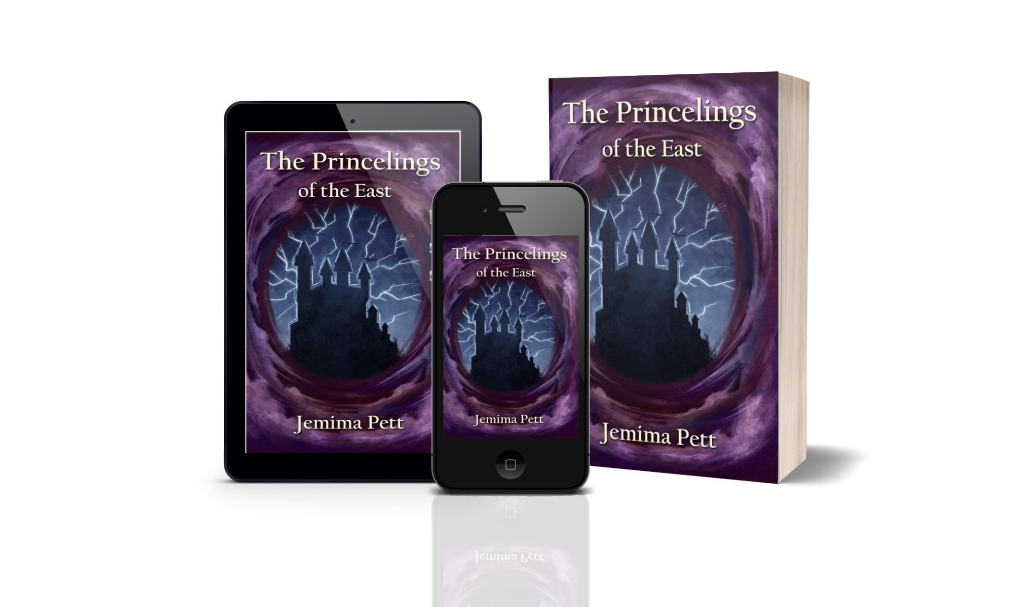
Well, I have five of the six new paperbacks in my hand. And I’ve found that a little block mark doesn’t show up on the publisher’s preview… the ellipsis mark and the em-dash don’t convert properly when loading the text and produce this block, which I have been carefully taking out when proof-reading the tiny text edit box, and then going through the online preview (they don’t do a print preview) I discovered after a while that this block may or may not show up – sometimes it’s two spaces instead.
Princelings of the East doesn’t have any in the print copy. Pirates has eight pages with them on. Lost City has four (I haven’t finished rechecking Talent Seekers or Victor yet). I obviously got better at spotting them, but as you can imagine I’m disappointed I can’t just press the magic button and release them all. But the good news is that I’m just waiting for the final version of Traveler’s cover to do that one too, which means that I can release them all together, and perhaps have a proper promotion for them as well. Any ideas what?


Hate that little stuff! Good luck getting it all perfect.
Let’s see…what would be a good launch? Like I know, right?